Why Appearance Matters
 It sounds shallow, but looks are important when it comes to an appeal—any appeal. That includes email appeals.
No one wants to pull up an email and see a screen full of tiny print.
And paragraphs that are 15 lines long are harder to read.
In fact, most people will end up deleting such an email without even reading it.
But the real reason an appeal needs to practice good formatting techniques is because it immediately forms an impression in the reader’s mind. A well-formatted email appeal says your organization is professional and legitimate.
A haphazard, messy email appeal looks like it comes from a less reputable or bogus organization. And no one wants that association for their organization.
Think about it.
How do you feel when you go to a website and it has great graphics and visuals, lots of useful information, and it’s presented in a well-organized and structured way?
You immediately think this site belongs to someone who is serious about their business.
And how do you feel when you pull up a web page with a bright purple home page that takes forever to load, is packed with text that is hard to read, and doesn’t seem to flow at all?
Like the owner of the site has no idea what they are doing. It gives you no confidence about their ability to help you, on in the case of a nonprofit, use your money in a responsible way.
Well, readers form the same immediate opinions when they read your fundraising appeals.
That’s why the format of your appeal is so important.
It May Not Be Exciting, But It’s Still Very Important
I know things like font size and the number of sentences in a paragraph aren’t very sexy topics.
But, believe me, they are extremely important when it comes to the success of your fundraising appeals.
Look at this Take Action Email from 350.org.
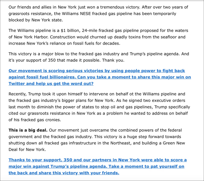
Even though the writer used blue ink to highlight the CTA’s in this email, all that text is overwhelming.

It would be much more reader-friendly with some images or graphics to break up the text and give some visual appeal to the piece.
But even if the writer didn’t add images or graphics, just adding more white space to this email would make this piece easier to read.
Below are the same first three paragraphs:
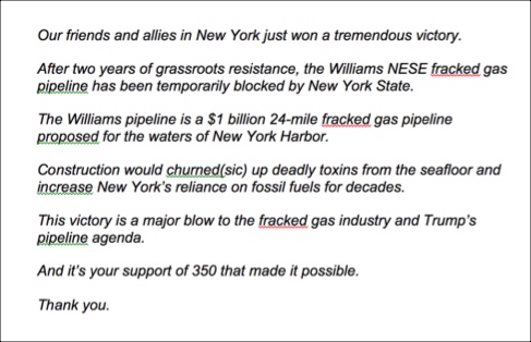 Even without any images, the new version takes less work to read.
Fewer sentences in a paragraph means that it’s less likely a reader will lose track of their place as they finish a line and move down to the next.
Of course, a few additional changes would make this appeal even better.
I would vary sentence length in this piece too.
And I would simplify the language.
But that’s a topic for another day.
Size Matters
Did you ever pull up an email and get a headache from trying to read it because the print is so small?
It’s not what you want to be remembered for.
This Email Appeal from Environment America used too small a font for their appeal.
Combined with a number of long paragraphs, it is very hard to read.
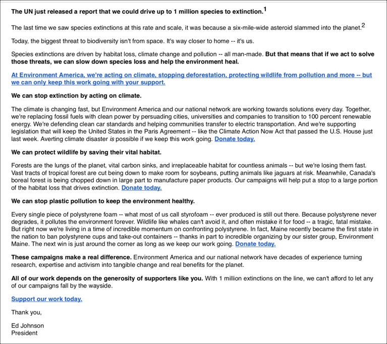
Most graphic designers and content writers will tell you that a font size of 14pt is optimal for reading text on a screen.
Now, I know fundraisers are trying to pack a lot of copy into a small space.
And everyone is trying to avoid making readers scroll.
But readers don’t just scroll.
They scan.
Try scanning the above piece.
Even the bold print is hard to read at this size.
Many readers just won’t make the effort to read such small print—even if your message is a good one.
My advice would be to write a compelling message in a print size that’s easily read. This will increase the chances that readers will read it—no matter how long it is.
Not Everyone Has A Big Budget
Budgets are tight in the nonprofit world.
Not all fundraisers have an in-house graphic designer or web designers.
Believe me, I get it.
But you can still make your email appealing and easy-to-read.
There are tons of free tools online from free stock photos to templates for emails.
And there are plenty of videos available online to show you how to use these tools, too.
But Use Formatting Tools With A Purpose In Mind
But before you use different formatting techniques like bullets or different colored fonts, you need to understand the purpose behind using them.
Bullets are used to:
- Create lists
- Emphasize things
- Make things easier to scan
And when writers use different colored inks in a piece, it’s usually to make different elements of an email stand out.
But most web content experts will tell you: DON’T USE MORE THAN 3 COLORS IN ONE PIECE.
Too many different colors ruin the ability of ANY color to stand out.
You can see what I’m talking about in this appeal from the Animal Welfare Association.
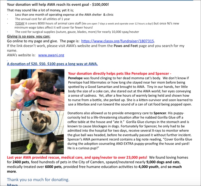
Not including the bold text, there are 5 different colored inks in this appeal.
The reader won’t know what to focus on.
And it looks messy.
Plus, the long paragraphs make it very hard to read.
Not Much Tweaking Needed
But, with just a few changes, it could be so much stronger.
First, I would eliminate the red ink. The text it is used for does not need its own color.
Then I would add some white space between the images of Penelope and Spencer. They are precious, but the images blend together because they are on top of each other.
Next, I would break up the text that details their stories.
The stories are compelling and heart-warming.
But not if they aren’t read.
Here is Penelope’s story with some white space added and the red ink removed.
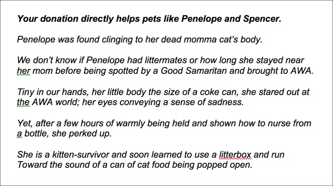
This is so much easier on the eyes.
This All Seems Like Nitpicking
I know it seems like I am being hypercritical when I talk about formatting an appeal.
But I’m not.
Formatting really does have an impact on the effectiveness of fundraising appeals.
Sometimes a BIG effect.
By using such formatting techniques as:
- Bullets
- 14 pt. font
- short paragraphs
- varied sentence lengths
- visuals and graphics
- different colored inks
- use of white space

you have already given your email appeal a better likelihood of success.
And that is worth the added effort.